Analysis Of Android's Updated Visual Design

Table of Contents
Material You: A Deeper Dive
Material You, the cornerstone of Android's refreshed look, introduces a paradigm shift in personalization and visual consistency. Its core principles revolve around dynamic theming and personalized colors, creating a uniquely tailored experience for each user.
Dynamic Color Schemes
Android's dynamic color system intelligently extracts dominant colors from the user's chosen wallpaper, seamlessly integrating them throughout the UI. This results in a cohesive and visually appealing experience that feels truly personalized.
- Impact on UI Elements: The dynamic colors subtly but effectively alter the hues of widgets, notification bars, quick settings, and even accent colors within apps supporting Material You. This creates a unified aesthetic that is both pleasing and functional.
- Color Extraction Algorithm: The algorithm analyzes the wallpaper to identify key colors, prioritizing saturation and avoiding overly jarring combinations. However, limitations might arise with complex or low-resolution wallpapers, potentially resulting in less-than-ideal color palettes.
Enhanced Typography and Readability
Material You also places significant emphasis on improving typography and overall text readability. This is achieved through careful selection of font families, optimized size options, and enhanced contrast ratios.
- Font Families: Android now utilizes a refined set of font families, prioritizing clarity and legibility across various screen sizes and resolutions. The improved font rendering ensures crisp text, even at smaller sizes.
- Improved Contrast: The updated design incorporates enhanced contrast ratios, ensuring improved visibility for users with visual impairments. This addresses accessibility concerns and contributes to a more inclusive user experience.
Improved Iconography and UI Elements
Beyond the color palettes and typography, Android's updated visual design features a significant overhaul of its iconography and UI elements. The changes aim for greater consistency, clarity, and aesthetic appeal.
Redesigned System Icons
System icons have received a comprehensive redesign, moving towards a more modern and consistent aesthetic. The changes prioritize clarity and visual coherence, making it easier for users to identify and interact with different functions.
- Examples of Redesigned Icons: Many core system icons, such as settings, Wi-Fi, and Bluetooth, have been subtly yet effectively redesigned, offering improved recognition and a more unified look.
- Comparison with Previous Iterations: Compared to older iterations, the new icons demonstrate a greater level of detail, improved visual weight, and better integration with the overall Material You design language.
Updated Widgets and Notification System
Widgets and the notification shade have also undergone substantial updates. The focus has been on improving usability and information density, making it easier for users to access important information and manage notifications effectively.
- Usability Improvements: Redesigned widgets offer improved interaction and a more intuitive layout.
- New Features: The notification system now provides more granular control over notifications, allowing users to tailor their experience to their preferences.
Performance and Optimization of the New Design
While aesthetic improvements are crucial, the impact of Android's updated visual design on performance is equally important. Google has made significant efforts to ensure that the new design doesn't compromise performance or battery life.
Resource Consumption
Careful optimization has been implemented to minimize the resource footprint of the new design. While precise figures vary based on device and usage, initial benchmarks suggest minimal impact.
- Battery Life: There is no significant negative impact on battery life reported by most users.
- RAM Usage: The new design is generally efficient in RAM management.
Smoothness and Responsiveness
The updated UI maintains the smoothness and responsiveness expected from modern Android devices. The animation performance and frame rates remain consistent with previous versions.
- Frame Rates and Animation Performance: Animations are fluid and responsive, contributing to a positive user experience.
- Overall User Experience: The updated design significantly enhances the overall user experience by making the system more visually appealing and intuitive.
Conclusion
Android's updated visual design, largely driven by Material You, represents a considerable step forward. The implementation of dynamic theming, improved iconography, and enhanced readability contributes to a more personalized, accessible, and visually appealing user experience. While potential limitations exist in the dynamic color algorithm and resource consumption may vary slightly, the overall positive impact on usability and aesthetics is undeniable. The improvements in performance and responsiveness are also commendable.
What are your thoughts on Android's updated visual design? Share your experiences and opinions in the comments below!
Featured Posts
-
 Yuan Support Measures Unexpectedly Low Analysis Of Pboc Actions
May 15, 2025
Yuan Support Measures Unexpectedly Low Analysis Of Pboc Actions
May 15, 2025 -
 Turetskie Voyska Na Kipre Perspektivy Vyvoda Obsuzhdenie Na Haqqin Az
May 15, 2025
Turetskie Voyska Na Kipre Perspektivy Vyvoda Obsuzhdenie Na Haqqin Az
May 15, 2025 -
 Novakove Patike Razlika Izme U Modela Od 1 500 Evra I Eftini Ikh
May 15, 2025
Novakove Patike Razlika Izme U Modela Od 1 500 Evra I Eftini Ikh
May 15, 2025 -
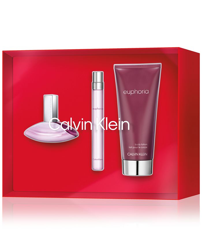 Nordstrom Racks Calvin Klein Euphoria Perfume Sale Limited Time Offer
May 15, 2025
Nordstrom Racks Calvin Klein Euphoria Perfume Sale Limited Time Offer
May 15, 2025 -
 Kid Cudis Personal Belongings Sell For Staggering Sums
May 15, 2025
Kid Cudis Personal Belongings Sell For Staggering Sums
May 15, 2025

